Good On You


Why we love
this site.

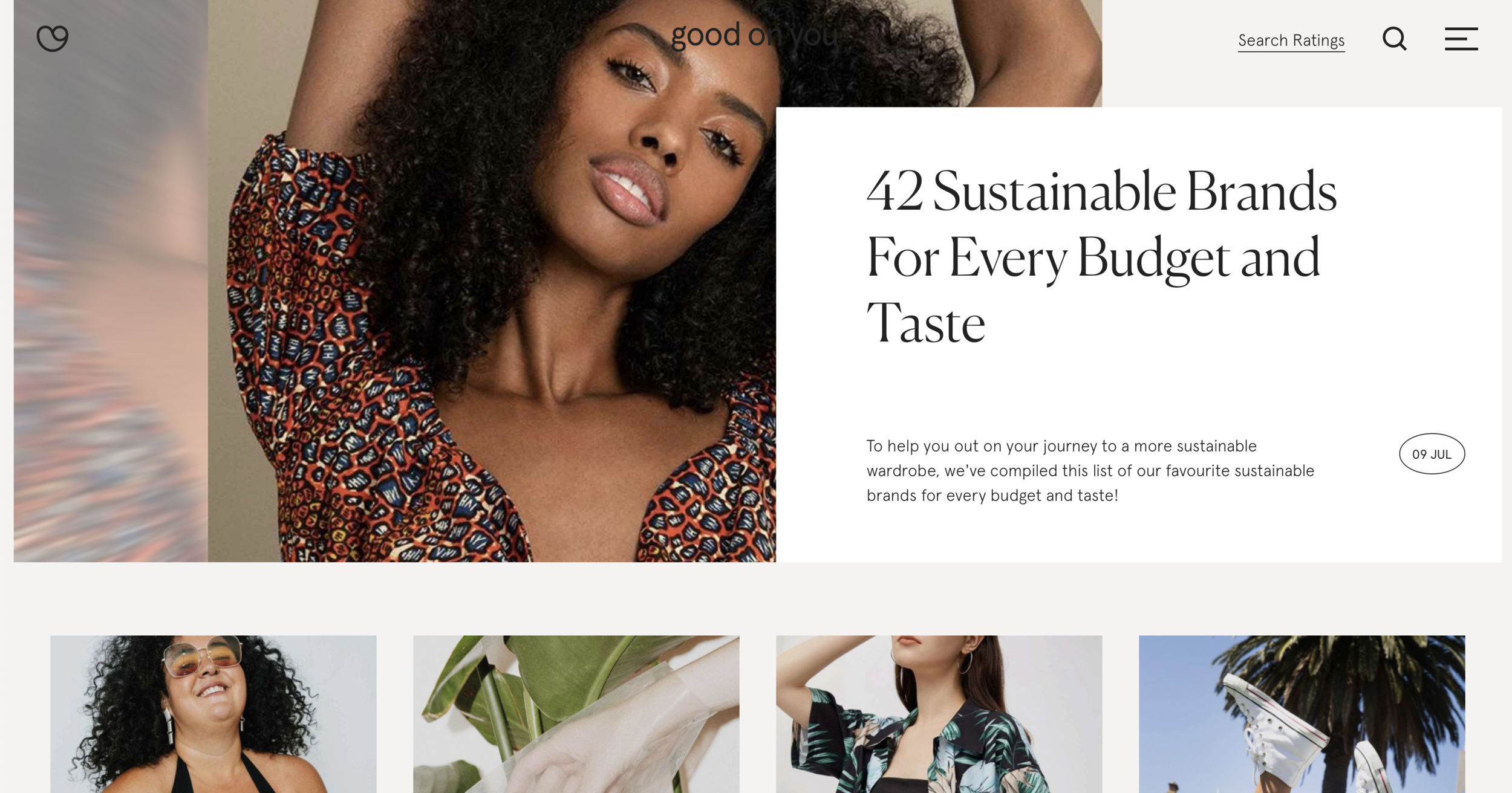
The site's design layout has clear paths to take, and the overall aesthetic feels clean, inclusive, and overall grounded. All of these factors align well with their values of standing for everyone making ethical and sustainable choices.The typography used is beautiful, with fonts feeling approachable and speaking with a high-quality tone.The subtle animations when you hover over an image and open up the navigation menu are also gorgeous.

Found by
Kathy Luong,
Squarespace Design Course Graduate 🏆


Platform

Wordpress

Fonts Used

Aperçu by Colophon Foundry
Canela by Commercial Type

Colors Used

Sky
#D4E1DE

Linen
#F5F3F0

Carbon
#222222

 
Smooth transitions and hover effects make the experience effortless and dynamic.

Smooth transitions and hover effects make the experience effortless and dynamic.


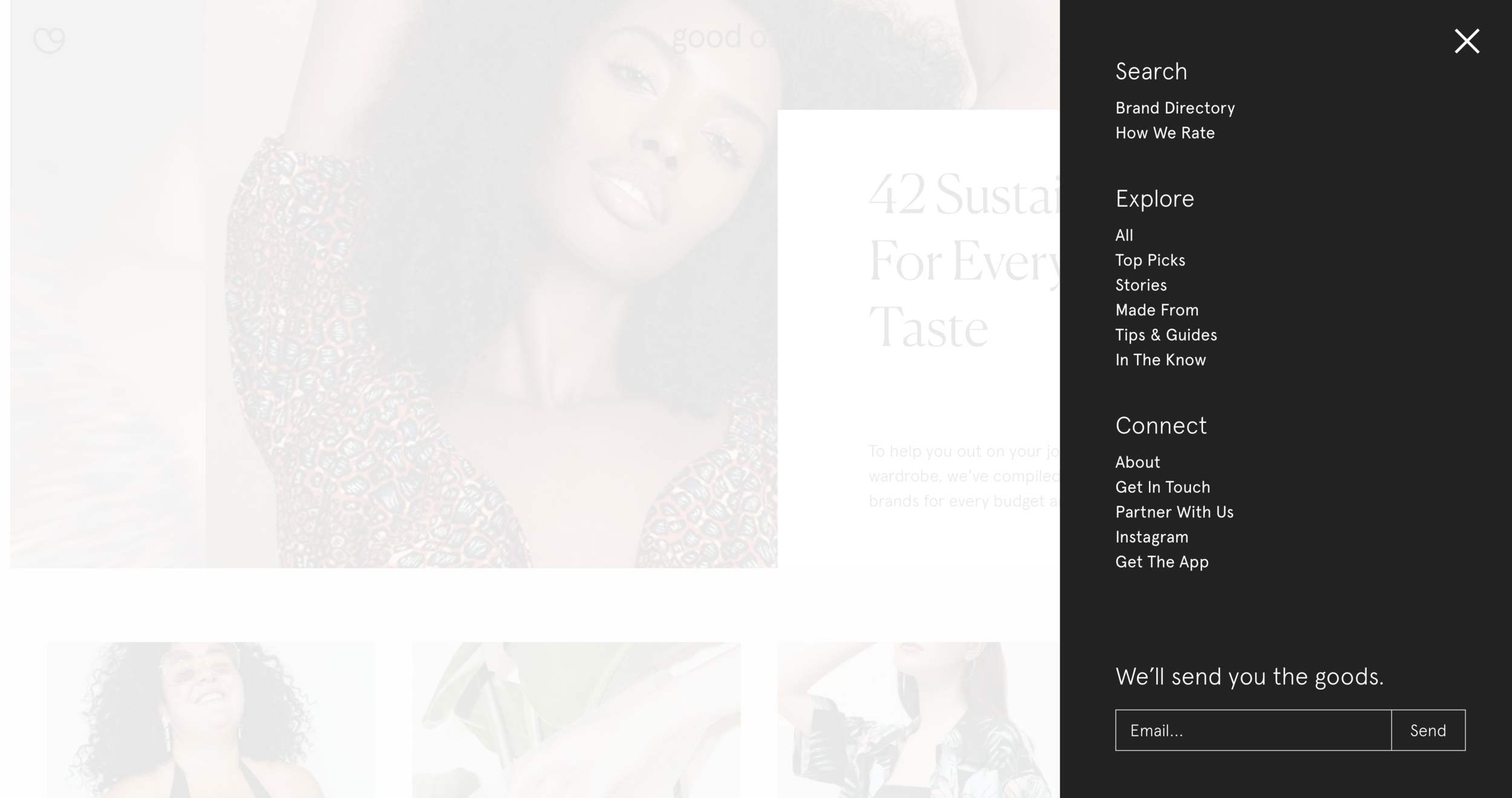
Right vertical navigation - we love the carbon background here!

Right vertical navigation - we love the carbon background here!


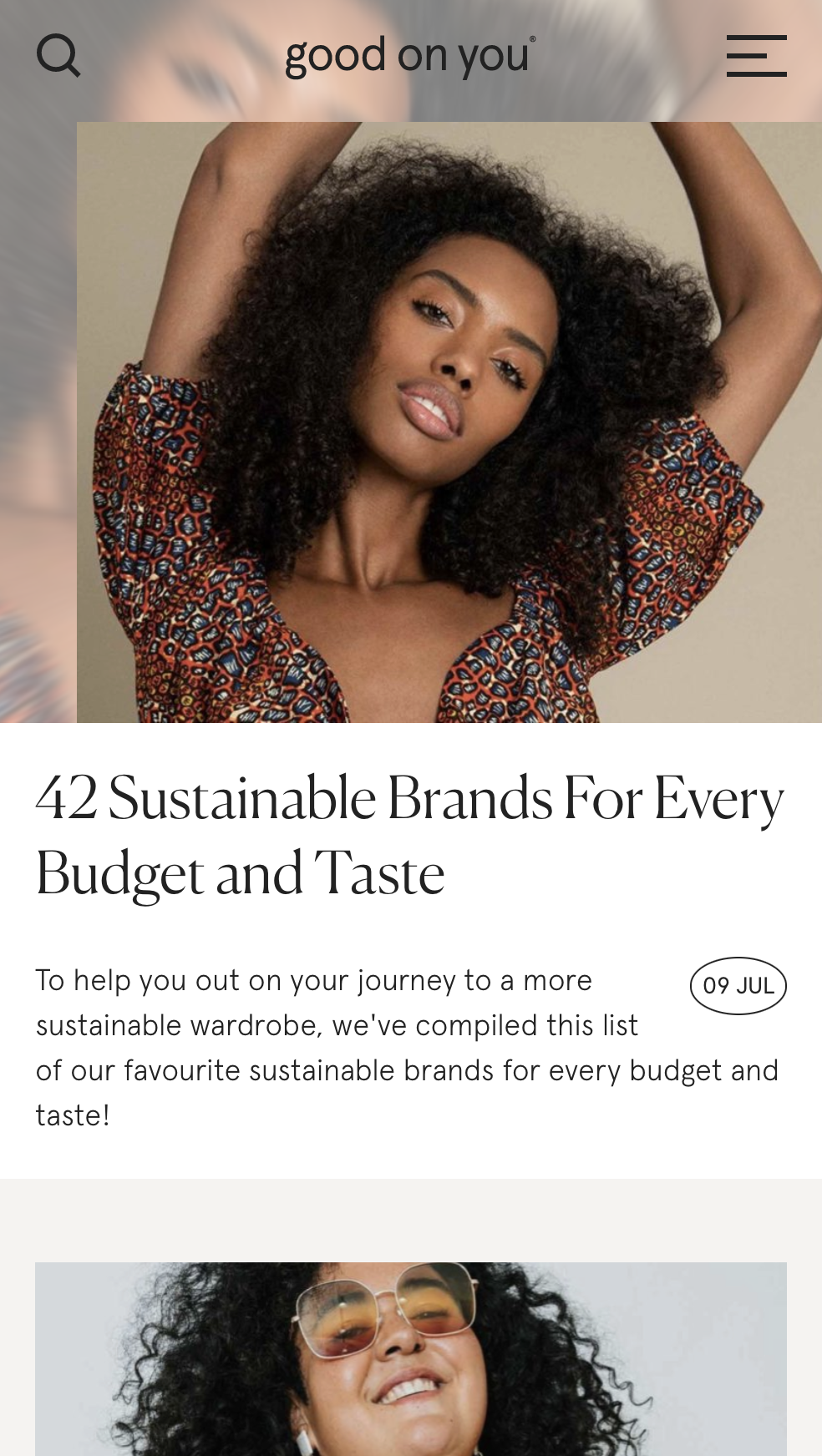
We love the way this layout stacks on mobile.

We love the way this layout stacks on mobile.


We love the article layout - it’s clean, easy to read and the type hierarchy is clear!

We love the article layout - it’s clean, easy to read and the type hierarchy is clear!